
The Content of OPAM project
1. The Structure of Research into Attitudes to Migration.
2. The Impact of Research into Attitudes to Migration.
3. The Geographic Distribution of Research into Attitudes to Migration, or: Who Studies Where?
4. Where Does Research into Attitudes to Migration Happen?
5. What Are the Ethnicities of People Researching Attitudes to Migration?
6. Gender Distribution of People Researching Attitudes to Migration.
We present a series of visualizations of a dataset of articles about public opinion towards migration, which underlies the meta-analysis authored by Dražanová, Gonnot, Heidland & Krüger (2023).
We analysed hundreds of scientific articles to understand more about this important and growing field of research. Our sample of consists of 529 articles. To construct it, we first settled on five base disciplines – Migration and Ethnic Studies, Economics, Political Science, Psychology, and Sociology. Using the journal-rankings provided by Clarivate (JIF), SCImago (SJR), and Google Scholar, we picked the top 30 journals from each discipline. The selection was then refined to articles with a specific focus on attitudes towards migration. Information was gathered into an accessible resource that allows users to dig into the details of scientific work on attitudes to migration.
Our analysis allows us not only to see the topics for research, but also more general questions about the composition and production of the social science scholarship on attitudes to migration. We provide insights in terms of method, research question, and sample, as well as the characteristics of the authors such as where they are based and their gender.
We visualize below the share that different journals proportionally take up in the final dataset:
Journal distribution within the sample

We also include a full list of the journals that ended up in our sample below:
Articles to include in the dataset were then selected by searching for 'immigration' or 'immigrant' in the chosen journals. As we were interested mainly in the recent state of the field, we restricted our sample to begin in 2009, leading up to the present, in 2021. Below we show the distribution of articles over time. The small number of articles in 2021 is explained by the fact that the data collection took part before the year had run its course.

We also show the distribution of disciplines throughout the period of interest. We note that psychology and political science consistently take up a sizable share of the dataset, while only very few papers in economics were selected under our sampling procedure.
Distribution of disciplines over time

To explore our sample in much more detail, we now turn to map it using citation analysis and natural language programming techniques.
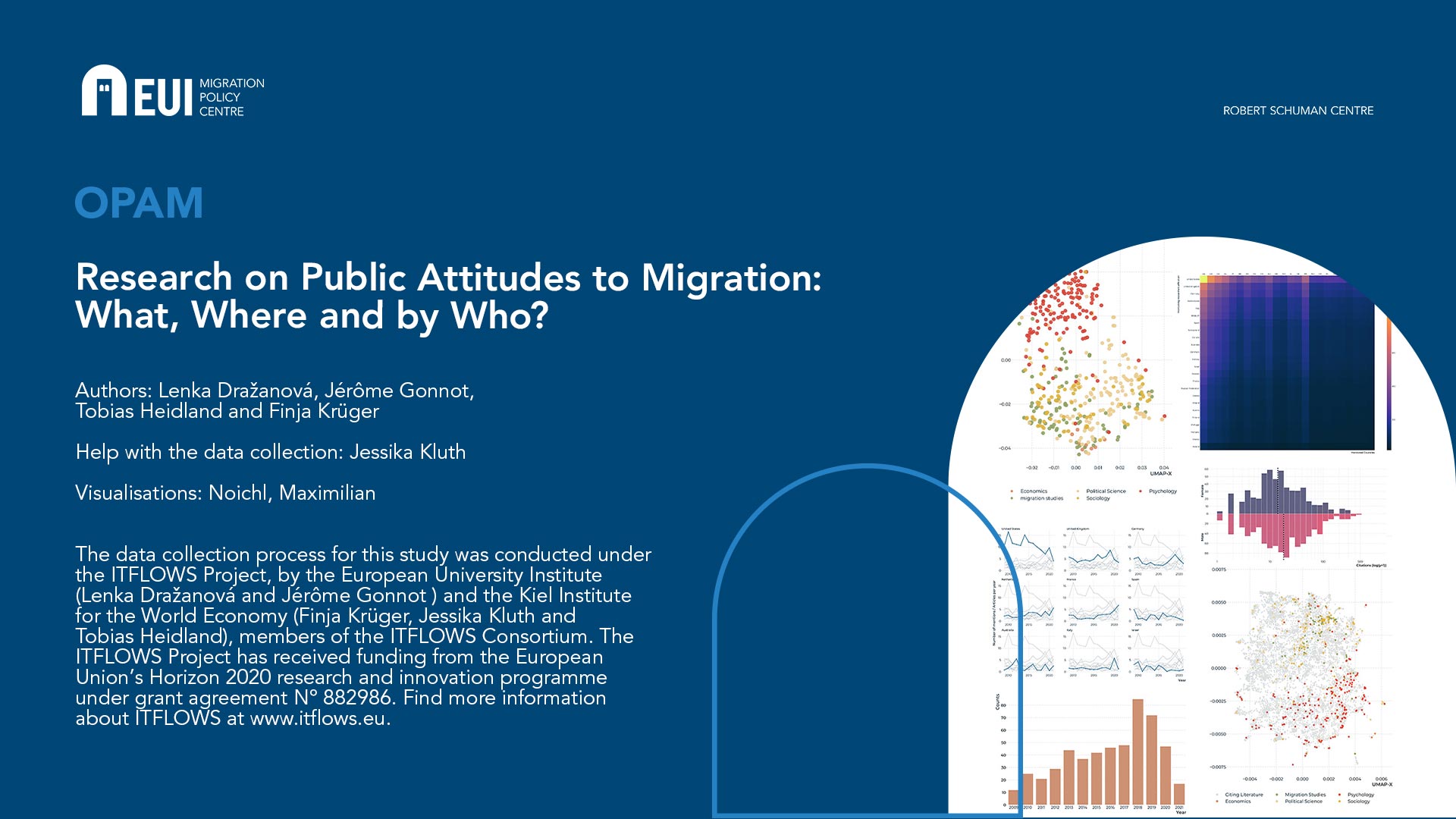
Articles, layed out by similarity in citation-patterns
Interactive explorer of 529 articles.
Articles, layed out by similarity in citation-patterns
Interactive explorer of 531 articles.
For a full functionality, please check the desktop version.
The two mappings above give similar views into our dataset, drawn from different sources. Each point in the mappings corresponds to one article. In the map based on citations, the distance between articles is determined by the similarity of their bibliographies. The layout is computed using a machine-learning algorithm called UMAP. Generally speaking, if an article cites the same source(s) as another one, the algorithm will try to place them next to each other. This makes for a very complicated arrangement problem: An article might for example be very similar to two others, which themselves have nothing in common, or might even, on their own, be removed very far from each other. This means, that the algorithm has to make many small trade-offs, and the mappings have to be interpreted with a certain caution. It must further be noted that the x- and y-axes can be safely ignored in these mappings, as only the relations between data-points are important.
To further ground this analysis, we provide a second view into the dataset which is based on the actual content of the articles. Here the distances between articles correspond to the similarities in the vocabulary that is used in the articles – articles that use many of the same words get moved close together. In both maps, the colors of the dots correspond to the disciplines from which we sampled the articles.
If your screen is large enough, the maps are displayed as interactive: If you hover over the dots with your mouse, you can see more details about each article, if you click on the dot, the article itself will be opened in a novel window. On the right side of the graphic, there are a variety of tools that you can use to interact with the graphic. Particularly useful is the Lasso-tool (second from above, enabled automatically). You can use it to select groups of points, and on the lower right of the graphic, the keywords will appear which differentiate the selected area most from the rest of the graphic. On the upper right side, we also provide a search bar to look for words or their parts in abstracts, titles, and names of the authors of articles.
Generally speaking, we note that both mappings seem to show a separation between articles from psychology, largely coherent towards the right side of the map, in red, and articles from sociology, political science, migrations studies, and economics, which are largely mixed, although some slight patterns appear to be visible.
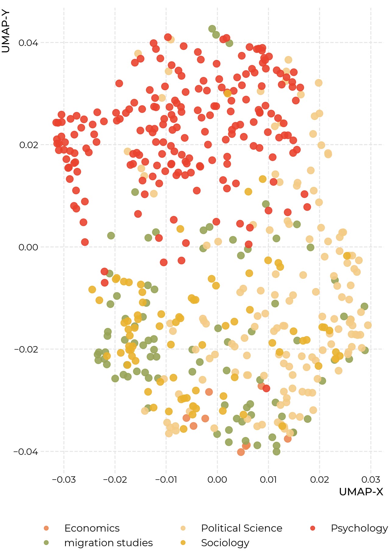
On the map below you can explore the 11.093 articles that are listed in the Web of Science as citing literature for the set of works above, as well as the articles themselves. The emerging structure can thus be interpreted as a kind of 'impact'-map for migration research. The blue lines in the background indicate the network of citations to articles in our base dataset. Again, we note two diffuse centers of psychology and the other disciplines. It also seems like psychology is more distributed over its corner of the map than migration research and sociology – which might suggest that psychological migration research is more integrated into its surrounding literature than these specific areas. But because of the tradeoffs in the production of these maps, we must urge some caution with these interpretations.
Articles, layed out by similarity in their bibliographies
Interactive explorer of 11093 articles

Location matters: to which countries does it pay attention? Where is it conducted? Where do the people conducting it come from? Based on the dataset introduced above, we try to give some answers to these questions.
To which countries does research into attitudes to migration pay attention?
To construct the map above, we went automatically over all the full texts in our dataset, looking for geographic entities using the spacy natural language programming package. We then disambiguated countries using the fuzzy-search option in the pycountry-package. The map displays the raw counts as a heatmap overlay. We can read this as a rough measurement that answers the question, about which countries the scholars in our dataset write about the most.
One important shortcoming of this method is, that it only captures concrete names of countries and large cities, but ignores regions (e.g. the Maghreb) and continents, as well as combined abbreviations (e. g. BeNeLux). If there is some systematicity in the way in which researchers talk about these geographic units, it might be lost. Nonetheless, we can hope that the precise language commonly employed in scholarly articles allows this measure to provide a useful proxy for where the attention of researchers lies.
It is immediately noticeable, the United States is the country which is mentioned by far the most, followed by the UK, Germany, and the Netherlands, as well as Australia and Israel. Below we provide the counts for the most prevalent countries, for a clear comparison:
How often are individual countries mentioned by migration scholars?

We can also take a look at how these attention patterns changed over time in the graphic below. Here counts are normalized by the number of papers in our dataset in the specific year. While the lines are very noisy, there seems to be a marked downtick of mentions of the United States in the dataset.
How has attention to countries shifted over time?

The map above shows the locations of the affiliations of researchers in our samples as circles, whose size corresponds to the number of noted affiliations. To construct the map, we went over all affiliations as they are archived in the Web of Science and extracted the city from the affiliation address, which we then used to mark on the map. Several things should thus be noted for the interpretation of the map. First, points are added for each contribution of a scientist affiliated to a specific location. So if a scientist, say at the University of Freiburg authors five papers, Freiburg receives five points. Second, multiple points are added in the case of co-authorship. Third, we disambiguate at the level of cities, not institutions. So El Paso does, for example, in the map receive points both due to the works of scientists at the University of El Paso, and Stanford University. We choose to approach the question in this way, as we are interested primarily in geographic distribution here.
Below we also show count data, both on the level of cities, which indicates the major hubs of research into attitudes to migration, as well as countries.
Number of contributions by city of scholars affiliation

Number of contributions by country of scholars affiliation
_")
After establishing both the locations of researchers, as well as to which regions they pay attention to, it is also interesting to overlay the two datasets into one figure, which shows us how often researchers affiliated to a country in the rows of the heatmap mention countries shown in the columns.
Who mentions whom

When asking ‘Who studies whom?’, an important part of the answer to ‘Who?’ is the ethnic background of researchers – Arguably it doesn’t only matter, where are the institutions, but also the backgrounds of the people conducting it. But as the ethnic background of a person can and often will be extremely complicated, and very hard to determine from a surface level, we must make clear that the results we present here can be read only as the roughest of estimations. While we hope that they can be of use to spark further discussion, we strongly advise against their inclusion in important decision-making procedures.
To estimate scholars' ethnicities, we turn to the python package 'ethnicolor', which provides a machine-learning model to estimate ethnicities from names, trained on a dataset of name-ethnicity-couplings built from Wikipedia-biographies (Ambekar et al., 2009). The general underlying idea is to represent names as a set of pairs of letters, which of course appear in different frequencies in names from different ethnicities/language-groups, to build a model that correctly predicts ethnicities from names based on the training data, and then to use that model on our novel, unseen data. Because these letter-pair analyses can only grasp from what ethnicity a name is likely to come, the resulting estimates will always be probabilistic. The name 'Jérôme Gonnot' is for example associated by our model with a Western/French heritage with a probability of 0.86, which could maybe also be Hispanic (0.081), but is deemed far less likely to be East Asian, with a probability of only 0.0052.
All ethnicity-estimates we produce are of this probabilistic nature, and in many cases much more uncertain than in the example of Dr. Gonnot. To reflect the inherent uncertainty of this approach, we do not simply assign each person the ethnicity that the model suggests as most probable. Instead, we simulate different scenarios. Over 2000 simulations we randomly draw an ethnicity for each person with the probabilities provided by the model. The results are model-consistent ranges of different scenarios which we visualize below. Each dot represents one simulation. We immediately notice that most of the researchers in our dataset seem of Greater-European/British descent, which includes of course a lot of Northern American names. Other generally European ethnic backgrounds follow suit. Only very little research in the present dataset seems to have been produced by people whose names suggest African or Asian descent.
Estimated distributions of author-ethnicity

A commonly discussed issue is the distribution of gender among scientists, and so it makes sense to investigate it also in the present sample. As the estimation of ethnicity above, estimating gender, especially in an automated fashion, is an inherently flawed process, which means that, again, our results can only be vague indications. To guess the genders of researchers, we make use of the Genderize-webservice, which returns us for each name in our sample a probability of that person to belong to a specific gender. In most cases, this probability is very close to either zero, or one, as many names are relatively clearly gendered. But some names, e.g. 'Deniz' or 'Andrea', rightly result in more equalized probabilities. To arrive get an idea of the global composition of our sample, we employ the same simulation-based method as above, randomly sampling according to the estimated probabilities, and plotting a range of many possible scenarios accordingly. To acknowledge in our procedure the possibility of mismatches between gender identity and legal name, we further switch the estimated gender with a small probability corresponding to an estimate of the prevalence of trans people, which has the effect of slightly broadening the ranges of our scenarios. The results are shown below.
Estimated distributions of author-genders

We note that across our whole sample, there were roughly one-third fewer women than men present among the authors. To see whether this effect represents a general feature of the whole dataset, or is more specific, we split these estimates by discipline, as shown in the graphic on the next page. There are stark differences between disciplines. Leaving aside economics, which we suggest to avoid interpreting due to the small proportion it commands in our sample, migration research seems to be the discipline closest to gender parity, while in political science and sociology the difference seems to be the most drastic.
Estimated distributions of author-genders, by discipline

A related interesting question is, whether there are any differences in terms of citations received by men and women in our dataset. Below we have visualized the distributions of received citations to male and female authors, as well as the median values of the distributions. Note that both the distributions and the medians are weighted by the probability of individual researchers belonging to one gender and that the x-axis has been log-transformed. We observe that indeed female researchers receive slightly fewer citations, specifically, four citations less than their male counterparts in the median. As citations can be considered the main currency in a highly competitive field, this seems to be a relevant observation.
Distribution of citations by gender

The explanation for this effect is currently unclear. One possible suggestion is that, as shown in the graphic below, citation rates in political science are much higher than in the other disciplines, which, together with our observation that political science has the most unequal gender distribution, might yield the observed bias. A further likely confounder is, that the amount of articles from different disciplines is not equal over time. Disciplines with comparatively older articles, might for example have had more time to accrue citations. But here further investigation might prove interesting.
Citation distributions between disciplines
